
Following tradition, my last few hours at Louise Fili Ltd were spent drinking prosecco and eating gelato on the roof of her 23rd Street studio. We toasted to the future and reminisced about the past while taking in the view of lower Manhattan. It was perfect mid-August afternoon. After the rooftop celebration, the flutes went in the dishwasher while I finished the bittersweet task of collecting and packing the belongings that accumulated on my desk over the last three years. I paused on a few meaningful objects, each in its own way so representative of my time at LFL.
1. Coccoina Glue Tin

Despite having no accent (thanks to my American mom), I was 19 when I left Italy and moved to the States for college. All too eager to reinvent myself, I assimilated quickly and allowed my Italian side to go somewhat dormant over the years. The first time I noticed a tin of Coccoina in Louise’s office I was dumbfounded: this was the glue we would use in kindergarten, l’asilo, where we had to wear white tunic-like uniforms and rounded, pastel-colored collars — what was it doing surrounded by the other gorgeous typography on Louise Fili’s blue shelf two decades later? Despite being intimately familiar with this object, seeing it in this new context allowed me to appreciate the playful Art Deco script, the chunky zig-zag borders, and the navy/white/silver color palette. Opening the tin, I remembered how the interior looks like a miniature bundt pan, with a tiny brush hidden in the center space and the stiff, almond-scented glue filling the main circular reservoir around it—which is such a clever design. As it turns out, this wasn’t just a relic of my past, but a fully designed, beautiful object, eliciting a special mixture of nostalgia and rediscovery I would feel often while working for Louise.
2. LFL's New Business Cards

As the first project I worked on after becoming senior designer, this business card was a turning point in my time at LFL. It’s so meaningful because it represents how Louise trusted me enough let me help her rebrand the studio. For the sake of the project and my sanity (I knew how easily I can get stuck in my own head and paralyzed by fear), I tried to ignore the momentousness of having a hand in designing the mark that would represent someone whose work I so admired. We arrived at a logotoype composed of graceful, decorated uppercase letters, elegantly spaced out and surrounded by a delicate cartouche of gold flourishes (expertly printed in gold engraving by Studio on Fire). When done well, cartouches look effortless and graceful, but achieving that sprezzatura is among the most technically-demanding tasks. It’s a puzzle—but one that, for Louise, I was happy to tackle.
3. Sparkly Neon Rainbow Pencil

Kelly’s last day at LFL, a Friday, was a very sad one indeed. Sure, It meant I was going to be promoted—which was definitely exciting—but she and I had grown so close in our year of working together, that I knew I was going to miss her terribly. When I first sat at my big, bright senior designer desk (10 feet behind from my old one) the following Monday, this sparkly neon rainbow pencil was waiting there, welcoming me to my new spot. Kelly somehow managed to hide it before leaving. Aside from representing her sparkly neon rainbow personality so well, it reminded me of what I realized on my very first day: I had become part of a close-knit, supportive family of past and present Louise Fili Ltd employees. Because it’s such a small studio, there’s not a whole lot of us, but over the years, we’ve worked for, leaned on, and learned from each other. It’s a little club I feel so lucky and grateful to be a part of.
4. Sketch Portfolio

Before switching to the iPad Pro, I was using this low-tech purple portfolio almost daily. Louise gave it to me while she was clearing her home in preparation for her big apartment move and it holds the sketches and notes for logos, book covers, and posters I created with her over the years. I hear there’s an air of mystery around how Louise makes such beautiful, sophisticated work — the answer might not surprise you: she has impeccable taste, a strong vision, incredible talent, and an encyclopedic knowledge of design history (as well as a huge library of primary resources). Her process, like mine, is very iterative and generates a bundle of sketches before the solution emerges.
It’s a process that seems more like pottery or psychic channeling: “I’m writing the words and letting them speak to me.”
—Louise Fili in an article by Amanda Shapiro for Bon Appétit
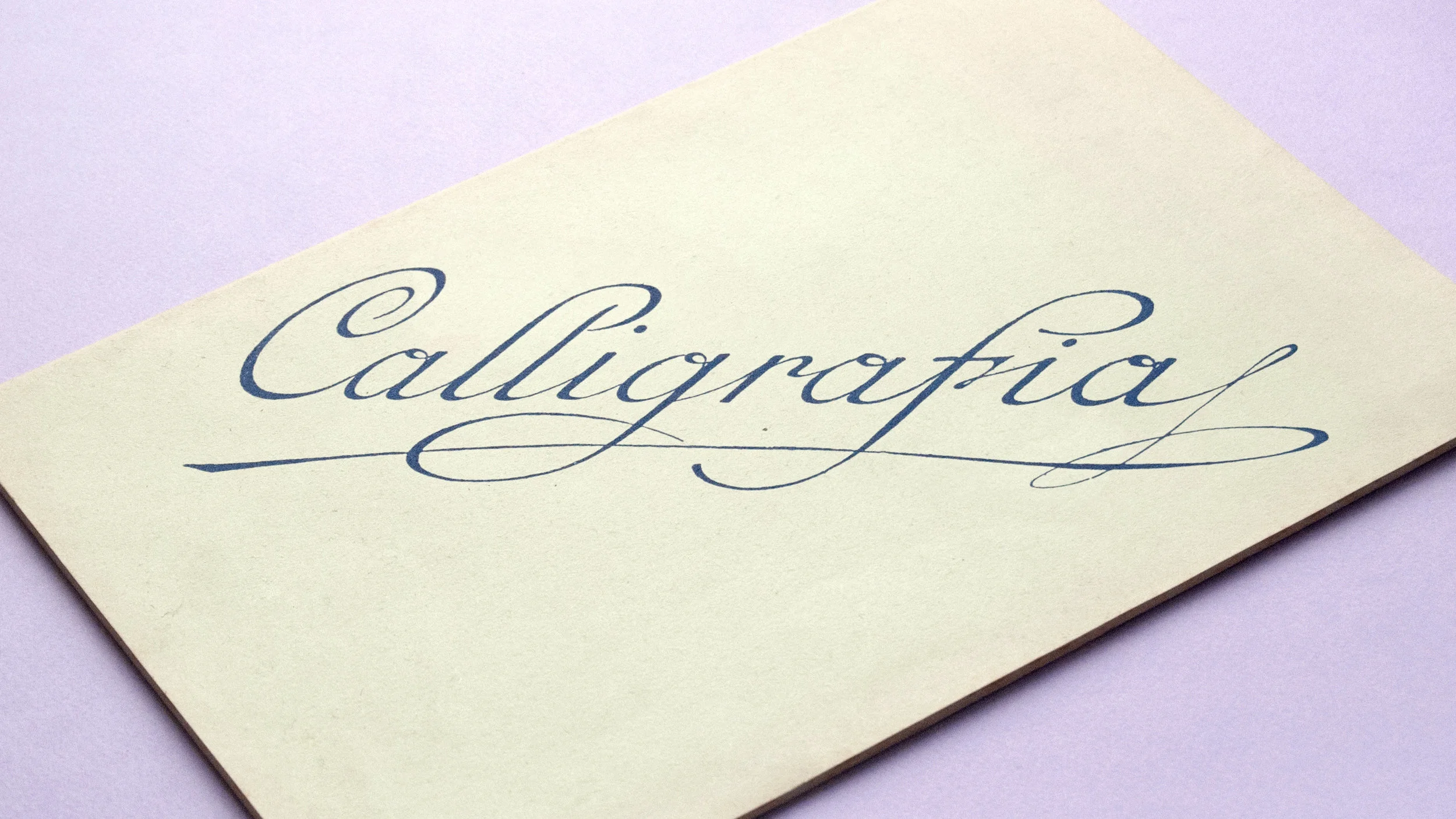
5. Vintage Calligraphy Sketchbook

Louise gave me this vintage calligraphy sketchbook, with its dramatically-lettered pale green cover, after her last trip to Rome just a few months ago. I absolutely love it, even though the interior pages are completely blank—or perhaps because of it. This is the second calligraphy-themed gift I’ve received from her; the first was a small, French penmanship manual filled with instructions and images, equally beautiful and yellowed with age. I’d only just started working at LFL when Louise returned from researching vintage signage in Paris for Graphique de la Rue and presented it to me. It was a useful gift and, since I’ve always struggled with script lettering, one I referred to again and again. Over the years, thanks to a good deal of practice, emulation, workshops, and guidance from Louise, my facility with scripts gradually improved, so I had the first book framed. These two books, one instructional and the other blank, feel symbolic as they poetically bookend my time at LFL.
Bonus: Mardell Wood Type Letters

Inspired by a Futurist type specimen in Louise’s extensive collection, she and I created a typeface for the Hamilton Wood Type & Printing Museum that was hand cut in wood. Named Mardell, after veteran pantograph operator Mardell Doubeck, it’s also available as a digital font. The reference material we based this typeface on didn’t have many characters, so a good deal of interpretation was necessary. I had established the rules used to create the original specimen and apply them to letters and symbols that didn’t exist in 1930s Italy (like J, Y, @, #, etc). This was my first time designing a typeface — let alone one that was produced and sold as a physical wood font — which made for a very exciting and rewarding experience. After returning from a visit to Hamilton Wood Type in Two Rivers, Wisconsin, Louise gave me these two letters, my initials.
Thanks so much for reading! To receive more or my writing directly, I’d love for you to subscribe to my email list.
